ANNONCE
Systems Thinking
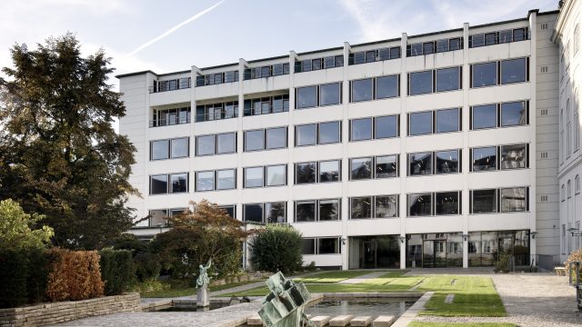
Svenn Eske Kristensen’s building combines structural clarity with sophisticated detailing. The transformation subscribes to the same principles.
Læs den danske version her.
Julian Jahn interviewed by Albert Algreen-Petersen
You were commissioned to convert a former corporate domicile into a shared workspace for a variety of tenants. How did this change of use impact the project?
We were contacted by the property’s present owners, who had just acquired the building and wanted to keep using it as an office space – but for rental purposes, not for themselves. So it was clear to us, even at this early stage, that our solution needed to be as versatile as possible. What they were looking for was something that could be subdivided in various ways to allow for future changes.
Originally designed by Svenn Eske Kristensen, the building appears as a rational system with a column-and-beam frame that not only shows in the façade but dictates a certain kind of organization based on individual offices and servicing corridors. I suppose that sort of building system is very flexible?
I guess you could say that the solution we came up with is consistent with the building’s basic structure and tectonics. What we did was to ensure that each individual office floor could be subdivided into as many smaller compartments as needed, within the supporting grid of columns and beams. We also divided the ceilings into sections, using a tiling system that follows the structuring grid. This means that you can remove individual ceiling panels and replace them with partitions whenever you want, giving the whole setup a practical, go-to flexibility by keeping things simple and making the spaces easy to adapt. The fact that we’ve incorporated cabling and outlets in the window parapets further adds to the flexibility of the spaces, as this means we avoid having cable boxes running below the windows. To access the internal supply system, all we had to do was remove the old panels, and there it was, linked up on the vertical piping system which is integrated in every other ‘pillar’ in the façade – though pillar is perhaps not the right word, as this is more a case of a covered box for water tubing, electricity, etc. Finally, we’ve replaced the ventilation system with a new setup that goes equally well with open and more segregated layouts.
How did it all look when you first embarked on the project?
The interiors were reconfigured in the late 1990s to make space for a governmental agency that had their offices there for a while. This general adaptation included more permanent solutions, such as fitting the ventilation below the characteristic beams and hiding it behind plaster-board ceilings. As these suspended ceilings recurred throughout the place, they made it very difficult to change or adapt anything. The result was that the building’s basic structure, which used to be such a defining element, had disappeared in an inferno of tedious office design.
How did you manage to strip away those layers and still make room for all the new installations?
When Eske Kristensen designed the cast-in-situ structure, he did it in accordance with the requirements at the time. However, if you want to change anything today, you need to base your calculations on current rules. This makes it difficult to drill as much as a hole in a beam, as you simply can’t prove afterwards that the structure has the required carrying capacity. The question is closely linked to the fire safety performance, as the standards there are higher for multi-tenancies, such as this, than for ordinary single-tenant properties. Anyway, we managed to carry out the technical alterations without penetrating or weakening the original construction, because there were these ducts incorporated in the original construction. To meet the stricter requirements, we replaced all those building parts and surfaces that didn’t work from a structural or fire safety point of view. Then there was a great deal of problems with draught and indoor climate – problems which stemmed from the fact that the building hadn’t been properly looked after over the years but also from inadequate insulation. So we installed a new heating and ventilation system, put up new, more efficient radiators and reinsulated beams and parapets throughout the building. And then the windows were given a good overhaul to ensure that the building envelope is tight – all things that contribute to the present, much improved level of comfort.
And without compromising the building’s structural and organizational integrity?
You can perceive the building as a technical machine for solving a specific task as shelter for people, and that task has led to an honest, straightforward structure with exposed radiators, ceilings with built-in lighting, etc. Everything is designed in accordance with the original architecture and its hierarchy: first you have the structural skeleton, and from there the level of detail increases the deeper you delve into the building, culminating with the elegant terrazzo shelves above the radiators, the pushbuttons for the lifts, etc. Like a gift that is gradually unwrapped. So we made a point of re-establishing that hierarchy.
Julian Jahn
Architect and design manager at Elgaard Architecture
Facts
Bredgade 40, central Copenhagen
Architects: Elgaard Architecture
Team: Bo Jørgensen, Janis Kalnins, Marisa Vaz, Marius Lund, William Celliers, Rasmus Hansen and Julian Jahn
Engineers: JL Engineering, Stokbro Consulting Engineers
Client: Jeudan
Completed: 2022
Original building
Architect: Svenn Eske Kristensen
Landscape architect: Eywin Langkilde
Completed: 1958
The architects’ own description:
This office building was designed by Svenn Eske Kristensen for the insurance company Baltica as an extension of the company headquarters in Bernstorff’s Palæ (J. G. Rosenberg, 1756). Although it has been subject to major changes over the years, the building is considered worthy of preservation.
Having analyzed the property through archival studies and on-site observation, we a conceived a strategy in collaboration with the client for how to develop the place in accordance with the original intentions.
The result is a fully renovated multi-user environment with a high degree of flexibility.
A new central staircase with a lift helps optimize the building’s usability and internal flow. Its ground-floor lobby and reception area has been expanded through incorporating some former outdoor spaces. Towards the street, a new ground-floor façade gives access to a shop. This was inspired by sketches from the original project.
The technical supply system is integrated as hidden installations in ceilings and façade, by simply using existing cavities in the concrete, and the façade has been energy-optimized.
A new, hidden ventilation system has improved the general comfort and allowed the beams to be exposed, like they were in the original design. The new aluminium-panelled ceilings are subdivided into sections that follow the structure’s basic modularity and allow users to rearrange partitions without first having to dismantle the ceiling.
Translation
The article was translated from Danish by Cornelius Colding.
The Danish version is published in the printed issue of Arkitekten 04/2023 and at Arkitekten.dk
ANNONCE
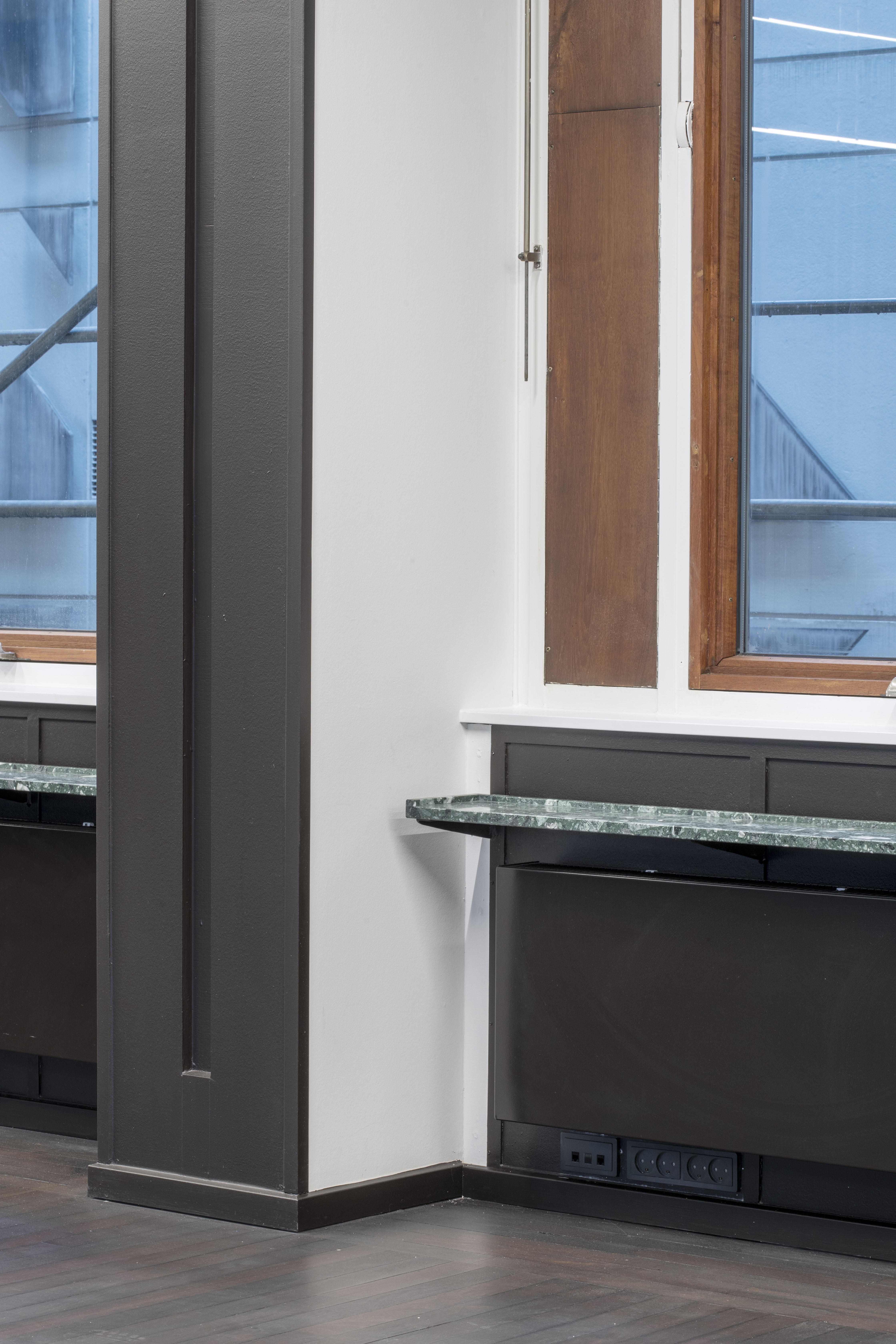
Renovated window in office floor corridor. Photo: Karina Tengberg
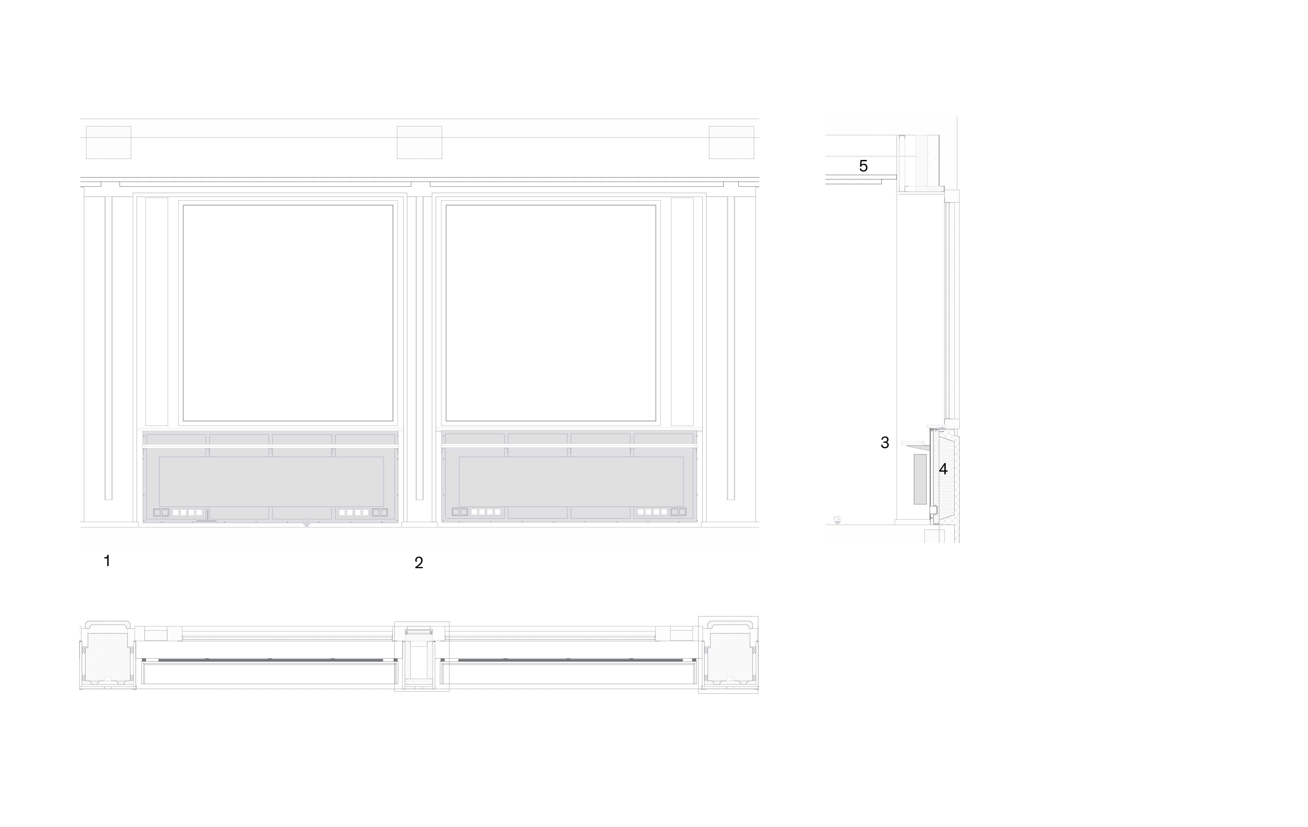
Detail, window section: 1. Supporting concrete column 2. Covered cable box 3. Reintroduced terrazzo shelf above radiator 4. Parapet with cables behind 5. New suspended ceiling lined with aluminium panels. Drawing: Elgaard Architecture
The ceilings were originally lined with aluminium panels – an element you chose to reintroduce?
Yes, we wanted to make a ceiling that tallied with the original approach. This has the effect of highlighting the ceilings, especially along the corridors where they appear as large expanses. Since new tenants are now allowed to rearrange the partitions themselves, it was important for us to make a ceiling that supports this function; so we ended up arranging the ceiling panels in a staggered pattern that ties together the surface. And then we have a further subdivision with a recessed panel between the columns, a detail which highlights the grid that used to run through floors, ceilings and walls. This extra, subdividing panel can be removed and replaced with a partition if needed – a practical, low-tech solution that promotes the building’s present function. We’ve incorporated lighting in the ceiling panels above all hallways and corridors, whereas the workspaces rely on suspended lighting, allowing users greater freedom, since new fixtures can be mounted or suspended through the panel’s perforation. This way you also avoid having all sorts of leads dangling below the ceiling.
You’ve expanded the floor area considerably by incorporating the middle building’s ground floor – a former covered outdoor space that now is glazed-in and heated. Could you tell us a bit about that?
Back in the day, when this was still the headquarters for Baltica Insurance, there was a clear hierarchy in the way the building was used. They had a large representational lobby, where guests first arrived. This was separated from the back building by a covered passage underneath the middle building, to be used by staff only. However, that’s not how the building is used nowadays, so it made good sense to combine the two ground floors in the front and back and turn them into one space. Another thing is the new shop that occupies part of the front building, something which of course reduces the size of the lobby considerably. This was an option Svenn Eske Kristensen considered himself and made several suggestions for. As the functionality of the shop required that the window parapets in two of the three bays were opened up, this means that the ground floor now has a continuous glass façade and better contact with the street outside. If we continue our tour into the backyard – a beautiful design from the same period by Eywin Langkilde – you’ll see that we’ve made a point of extending the façade’s general approach to our design of the new extension. This façade spans seven bays, of which the three at the bottom, next to the main building, used to be open. This opening was important, we felt, so we chose to recess the glass behind the front columns, thus highlighting them as more open than the rest; but since we also wanted to emphasize the tiny courtyard’s clear-cut geometry, it was important for us to keep the glazing flush with the façade on the back of the side building.
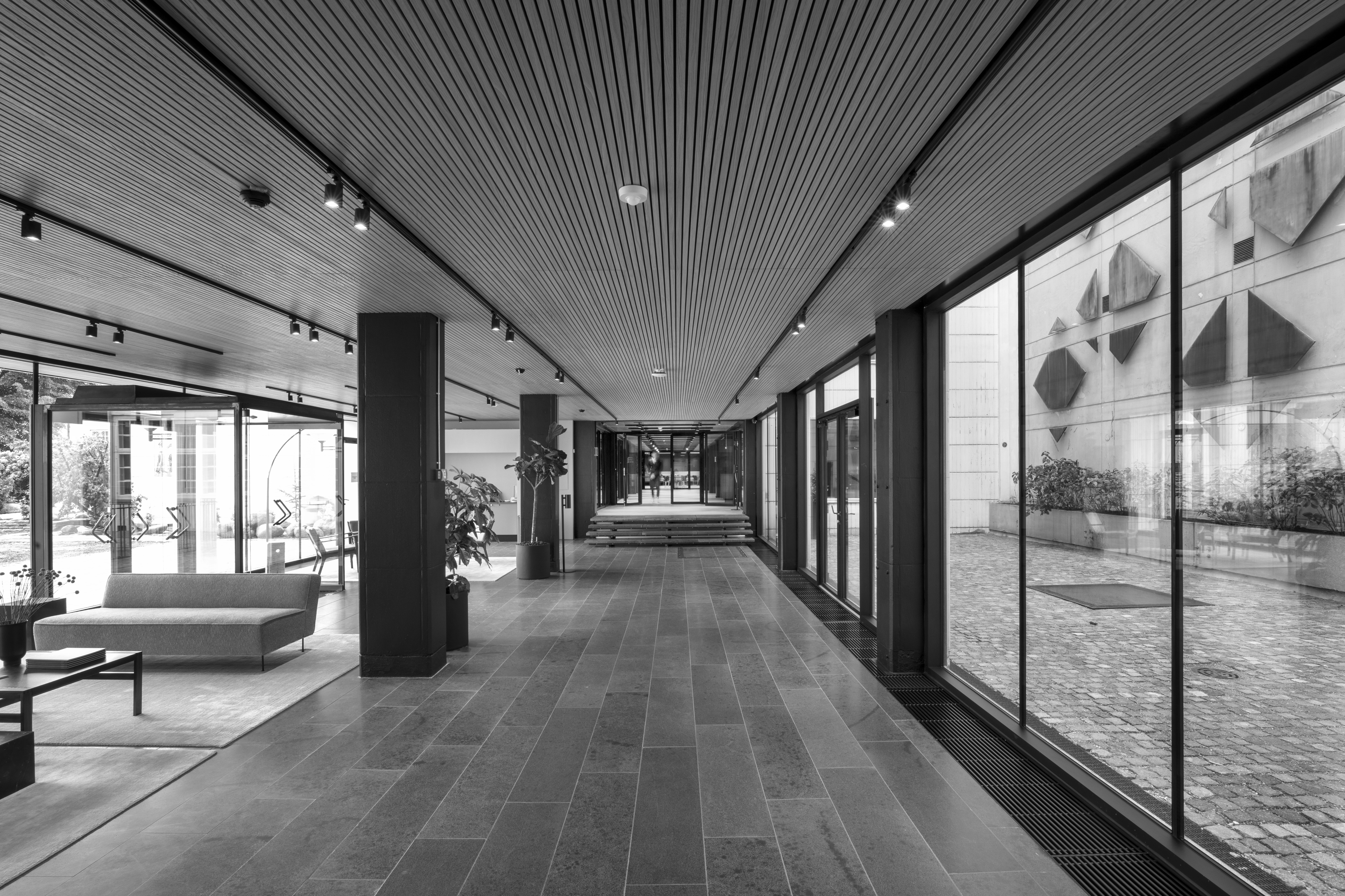
Photo: Karina Tengberg
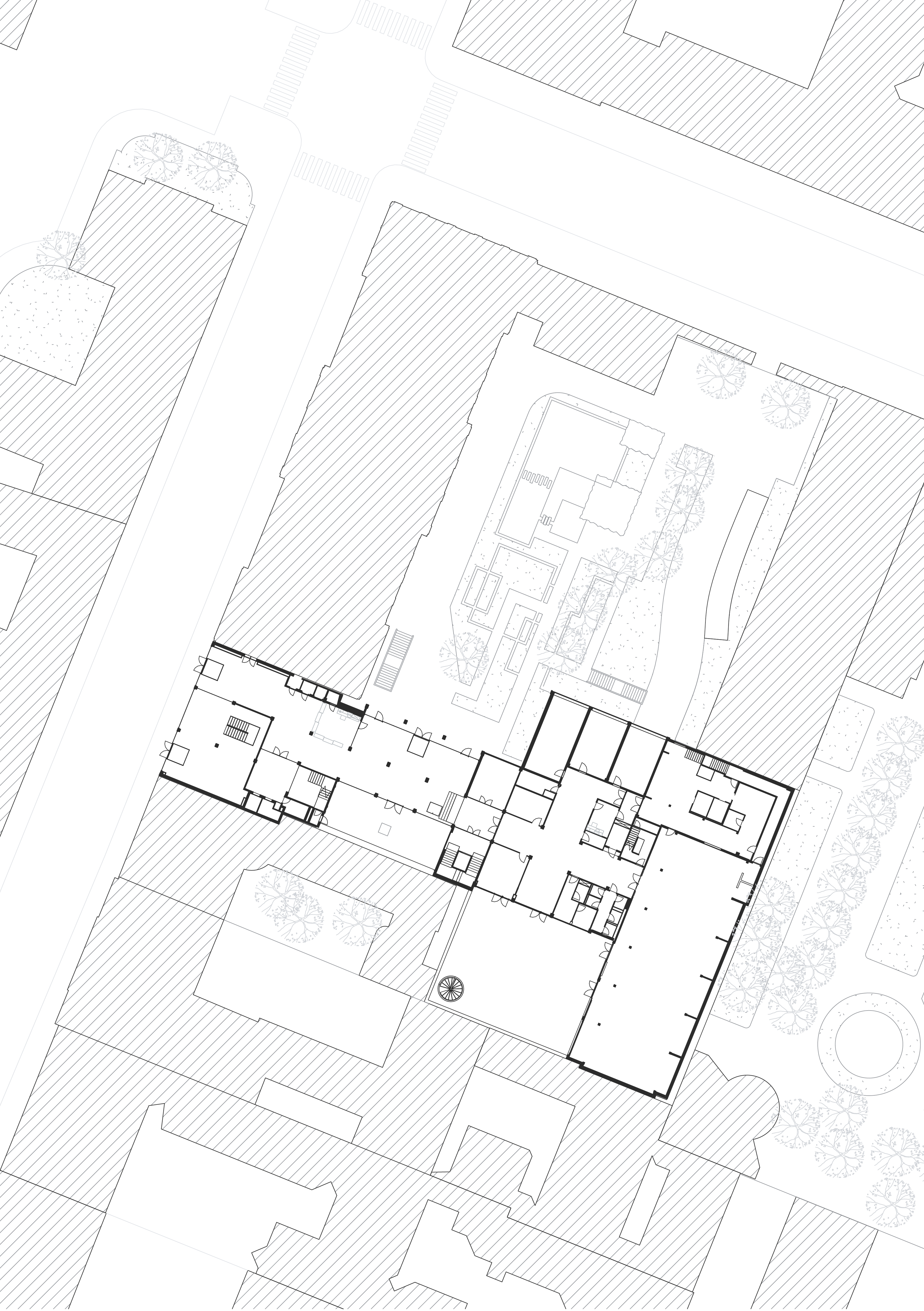
Site plan. Drawing: Elgaard Architecture
And then you’ve added new airlocks at the front and back entrances?
Yes. These pretty much follow the recipe from the original double-door airlock towards Bredgade, which was torn down long ago. However, regulations now require that entrances like these are completely airtight, include curtain heating etc. for the lobby to be suitable as a workplace. It was moreover important for us to keep the airlocks free of walls and ceilings in order to preserve the building’s lightness, as envisioned by Eske Kristensen. We had to scale everything down a bit, since the ground-floor ceilings are not that high. And then we were helped by the fact that there’s a basement below where we could integrate a lot of technology, run cables, etc. This also allowed us to integrate convector trenches in the middle building, which minimizes the problem with down-draught from the new glass façades.
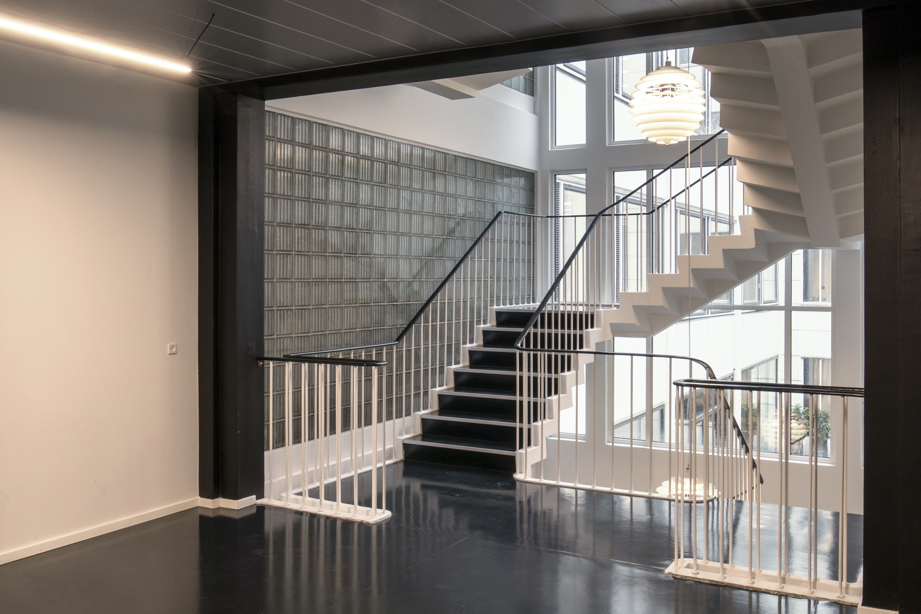
You’ve also added a brand-new staircase and lift?
Yes, the introduction of new escape route stairs and an accessible lift is absolutely essential to the way the building is used today with many different tenants. But, more than this, it’s also just a daily pleasure with this improved functionality and flow through the building, which allows you to walk from your office right down to the lunchroom, without having to queue up for the lift every time. That was a common scenario before, when there was just one shaft with two small lifts. We tore those down and replaced them with the new stair that has a lift integrated in the stairwell. The design draws heavily on the front building’s original main stairs but here reinterpreted as a light-coloured structure made from high-strength concrete. Instead of an open stairwell, as in the main stairs, we’ve integrated a glazed lift, which comes across as a sort of light prism when you pass around it as you climb the stairs. It also serves as a small reminder of the glass bricks in the original main stairs. We’ve used corrugated glass that reflects the light. The glass pattern is offset vertically as well as horizontally, just like the panels on the aluminium ceilings. This way it corresponds with the original design and its use of increasingly finer details as you zoom more and more in on the project.
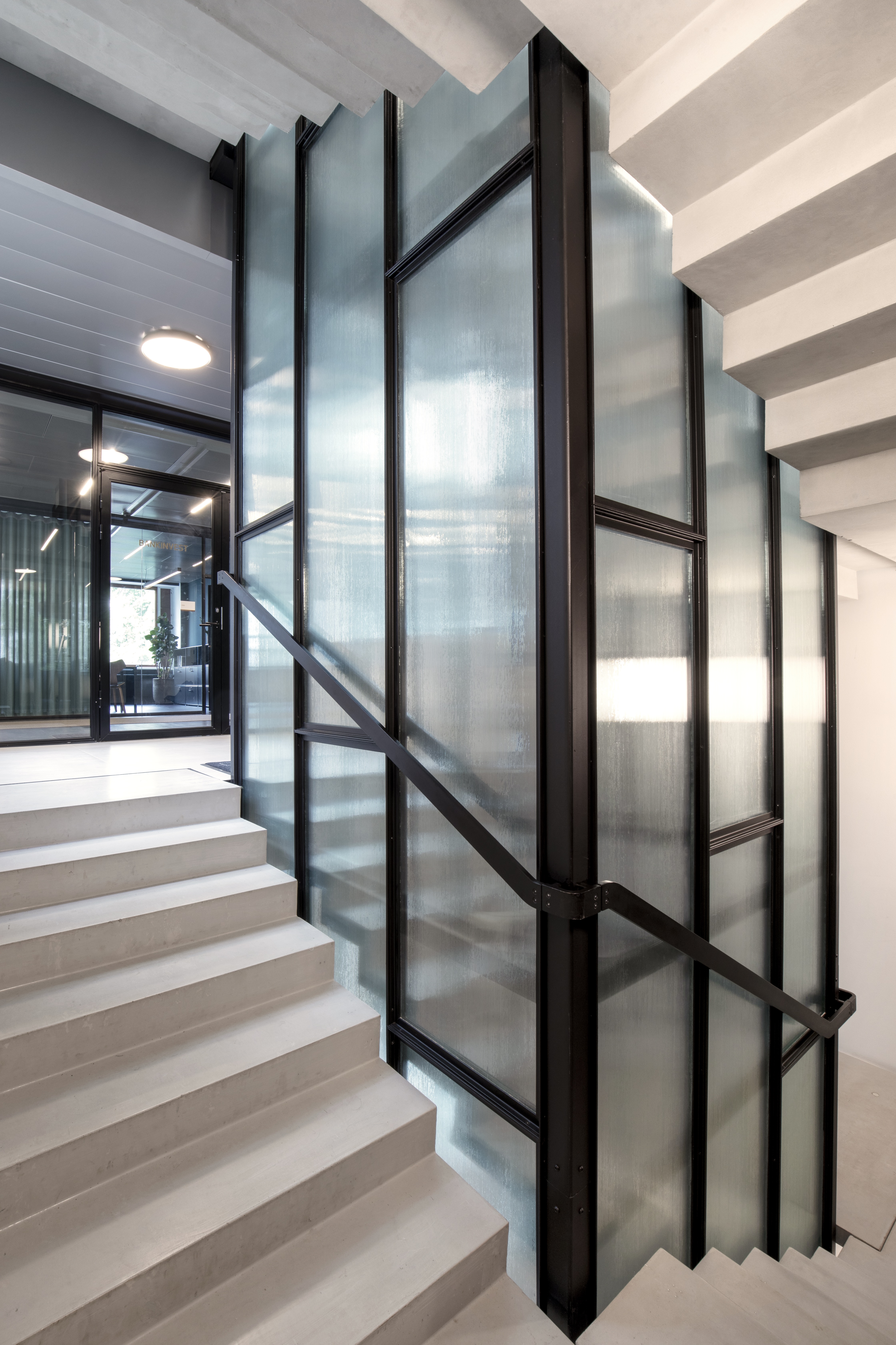
New stairs and lift. Photo: Karina Tengberg
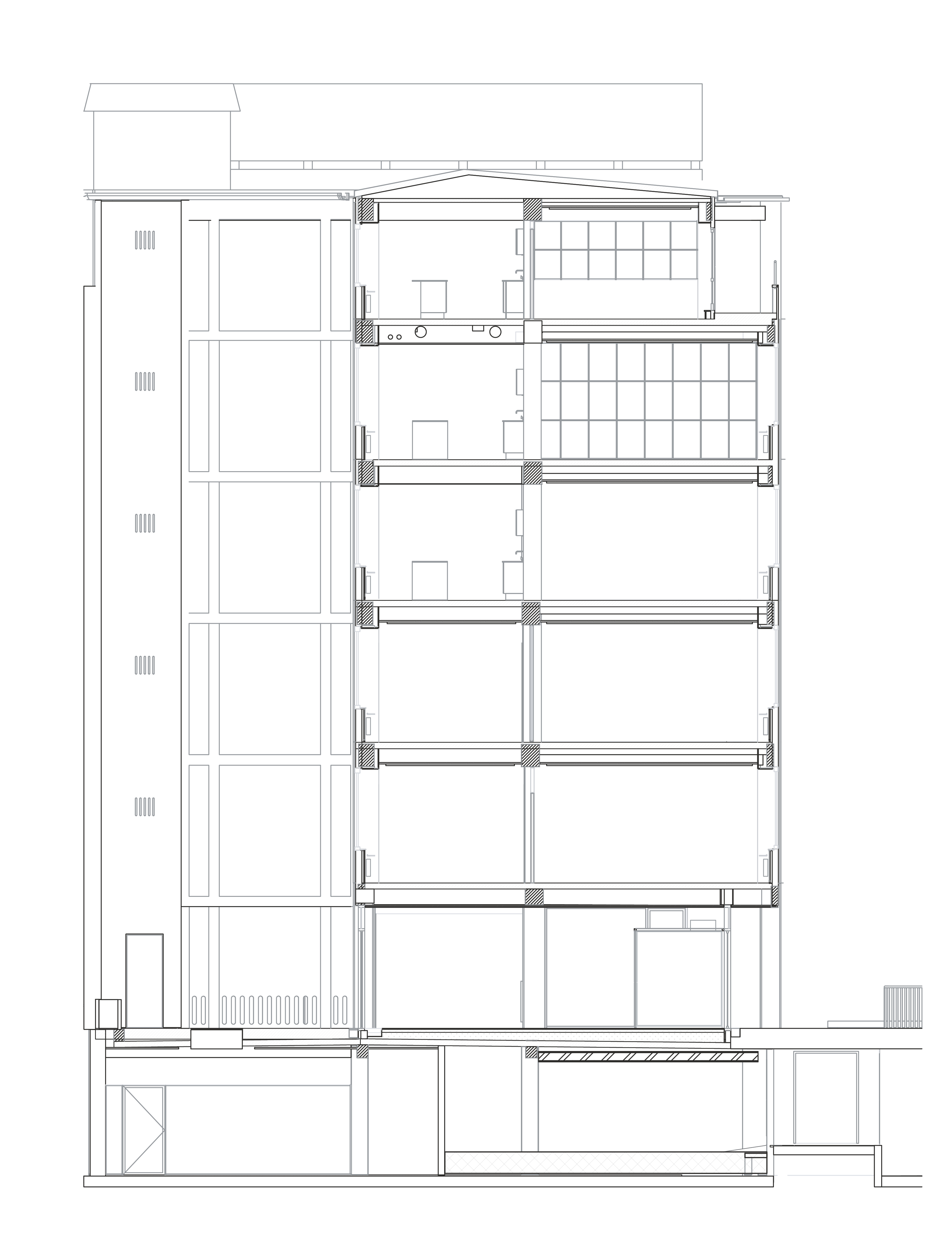
Section. Drawing: Elgaard Architecture
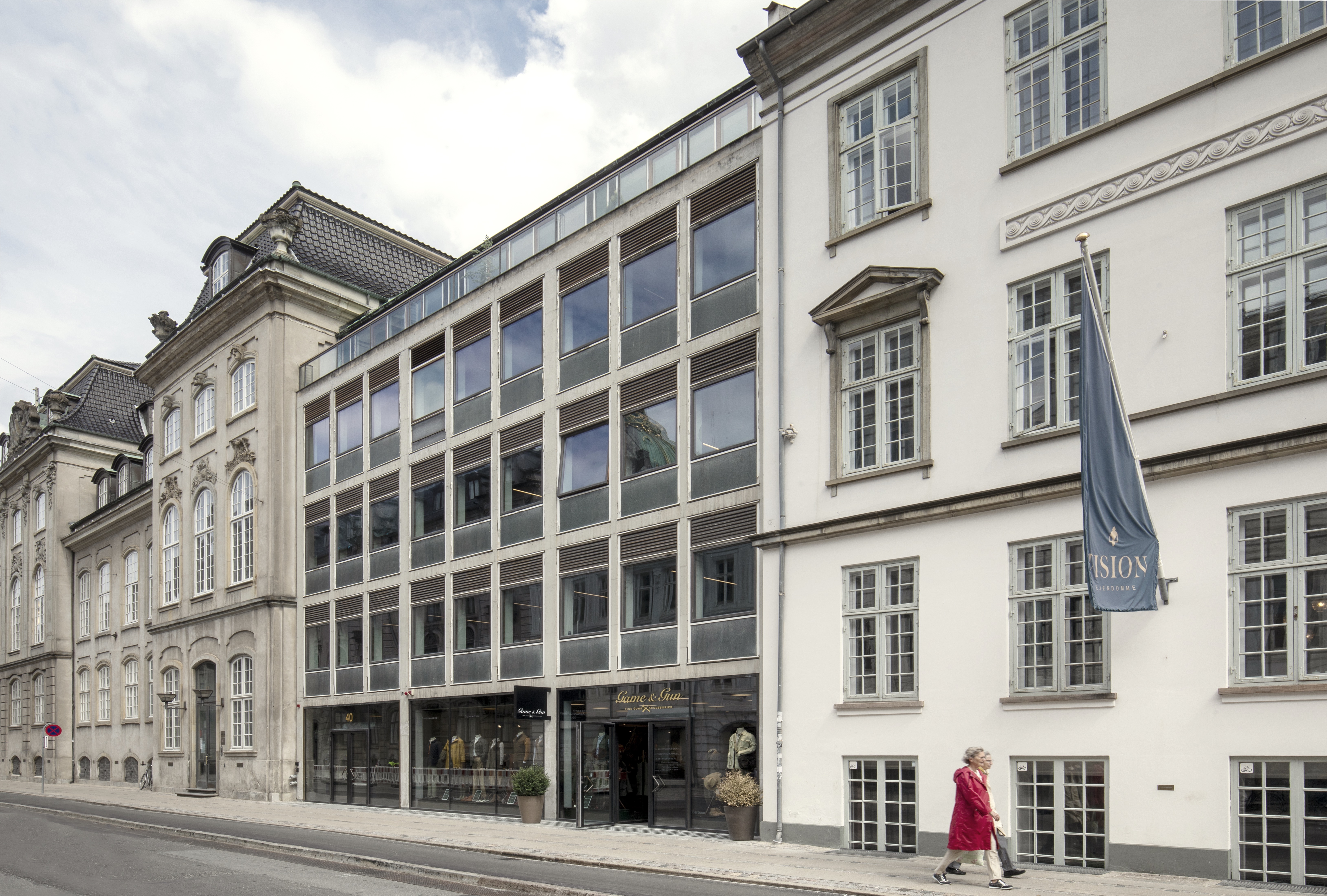
Street front towards Bredgade with new entrance and shop. Photo: Karina Tengberg
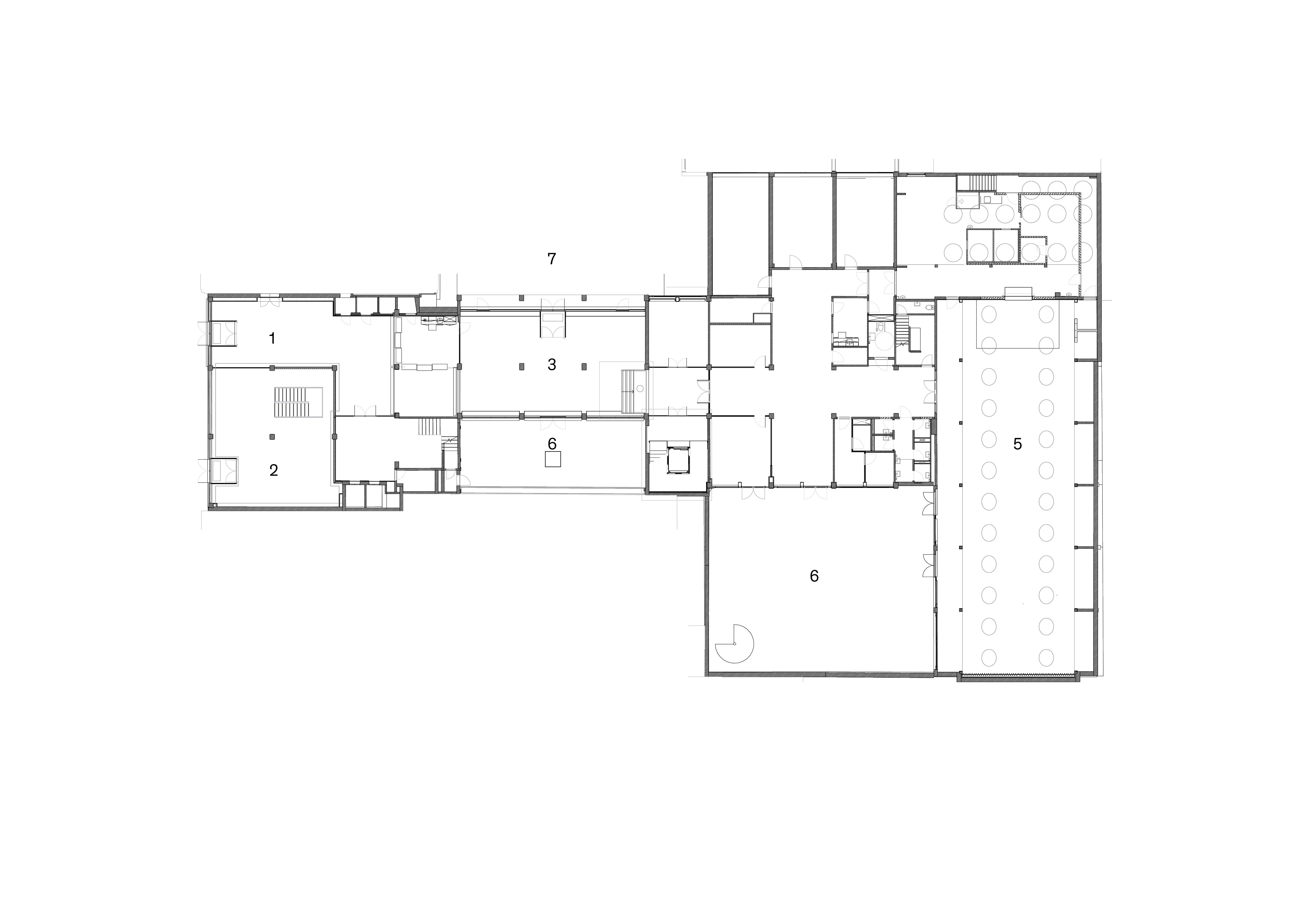
Ground floor: 1. Lobby 2. Shop 3. New lobby in middle building 4. New stairs and lift 5. Lunchroom 6. Courtyard 7. Garden. Drawing: Elgaard Architecture

First floor and section. Drawing: Elgaard Architecture.
Renovated stairway. Photo Karina Tengberg