ANNONCE
The Art of Calibrating
Hidden behind Codan’s monastic facades is a brilliant aesthetic and spatial flow.

Martin Keiding
Chefredaktør
Arkitekt MAA
Læs den danske version her.
Had this building been conceived in the 1960s, then nobody would have batted an eye at its structural sophistication and spatial generosity. Back then, everyone – from client to architects and workmen, users and architectural media – would have taken such things for granted. If you look at its qualities: the efficient functional flow, the spacious hallways, the loads of built-in cupboards, the fine distribution of daylight, the view, the high ceilings, the careful attention to those spaces where people gather and the decent materials, this could just as well have been an office- and warehouse complex designed by one of that period’s leading modernists. To see these qualities reintroduced in a contemporary context, and apparently without effort, feels like a rare treat, considering that, lately, we’ve got so used to rejoice if just a single door frame fits tolerably well into its slot in the wall.
Indoor climate and acoustics, on the other hand, were surely worse back in the 60s – with excessive use of energy, thermal bridges everywhere and loads of asbestos and PCB – but new, improved technologies and materials help us take care of that. And this project is no exception. Here, the use of concrete for the main structure links past and present. We still build lots of things from concrete here in Denmark – just think of the tunnel elements for the Fehmarn Belt Fixed Link or the new Storstrøm Bridge. The building in Køge will surely not be the last commercial or industrial building to be built from this non-sustainable material.
Still, I can think of loads of construction projects – housing, in particular – where there were no architectural or aesthetic reasons whatsoever for using concrete.
Whereas in this case, everything seems to revolve around the concrete, not only because of its quality as a durable building system and economical option, but because concrete has some very specific textural properties as a material which are crucial to this assignment. Add to this that the loadbearing walls with their great thermal mass help stabilize temperatures in the company’s warehouse, thus reducing the need for cooling.
Martin Keiding
Chefredaktør
Arkitekt MAA
Facts
CODAN – Office building and warehouse
Køge, Danmark
Architect: Johansen Skovsted Arkitekter
Landscape architect: Marianne Levinsen Landskab
Engineer: Strunge Jensen
Client: CODAN Companies
Built: 2023
Issue
This article is published in Arkitekten 04/2023
Translation
This article was translated from Danish by Cornelius Colding.
The Danish version is published in the printed issue of Arkitekten 04/2023 and at Arkitekten.dk
ANNONCE
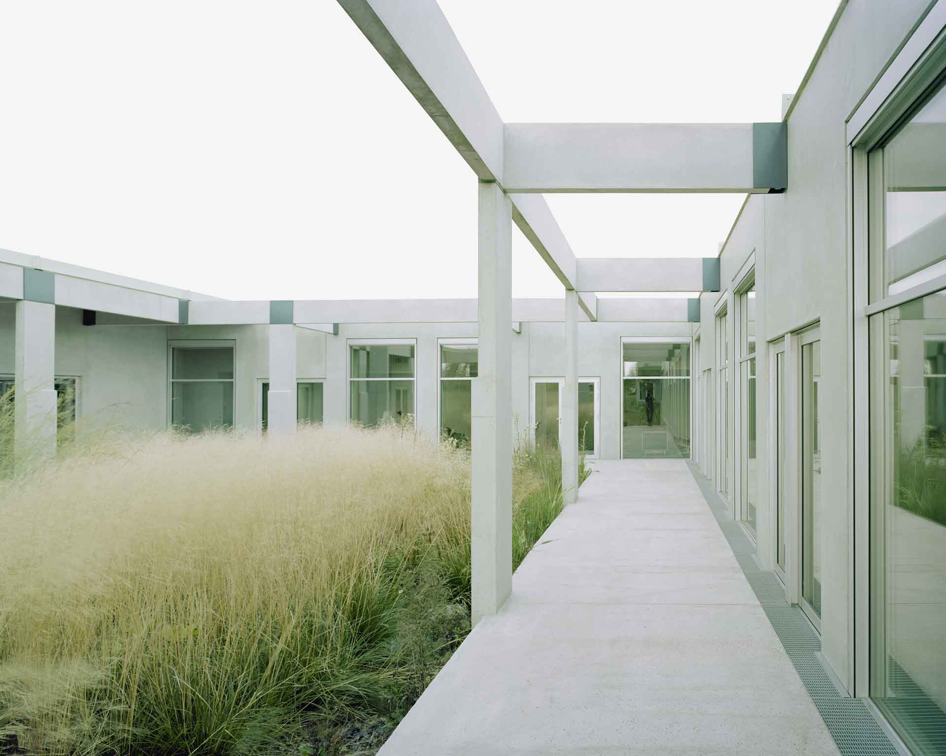
Photo: Rasmus Norlander
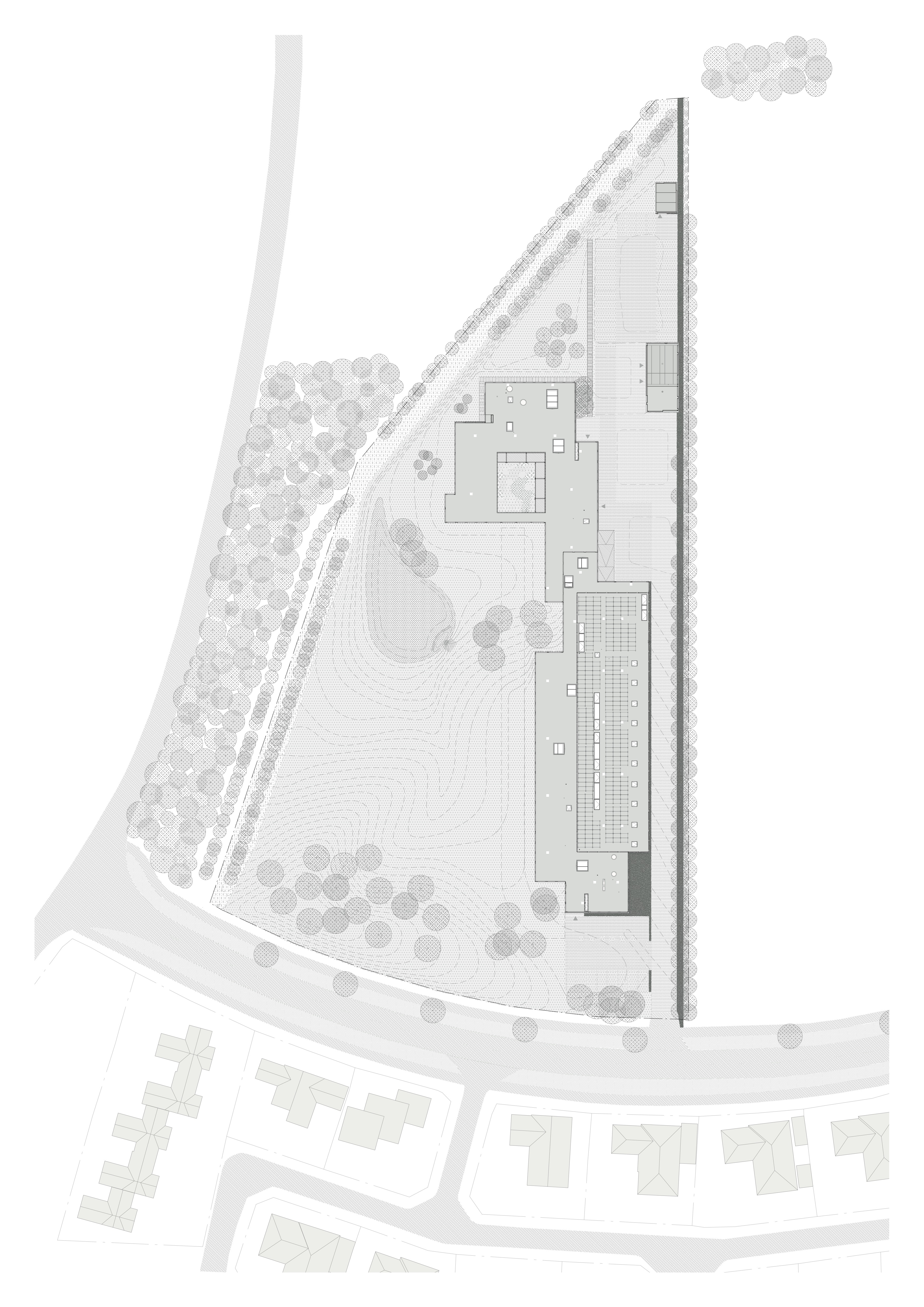
Site plan. Drawing: Marianne Levinsen Landskab and Johansen Skovsted Arkitekter
The client’s choice of location has to do with the upcoming Zealand University Hospital Køge, which is currently being built nearby and already partly completed. When doing their planning for the hospital, the municipality decided to parcel out some associated areas and earmark them for health-related construction, in this case a medical supply company. As the building site itself sits on the edge of the development, facing a road with hedgerows, it means that the view on this side will in all probability remain undeveloped, which is why most of the offices face this, calmer way.
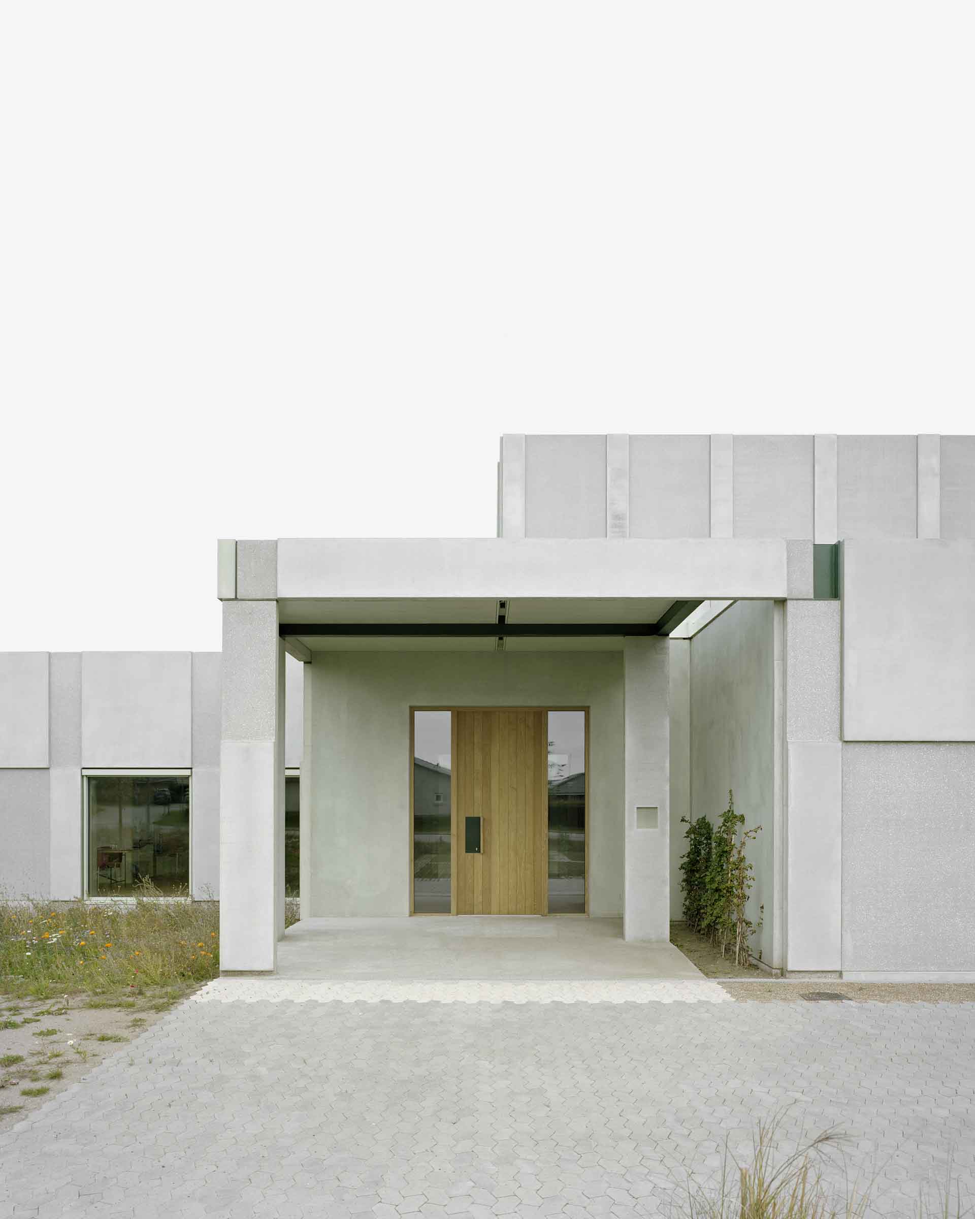
The warehouse itself, with its approach in front, takes up most of the side along the adjoining plot, which will probably be developed itself at some point. The building’s main public access faces south-east, but behind the warehouse is a large, common parking area for staff and management with its own internal entrance, corresponding to the one in front. Adding to these is a third entrance round the side by the administrative offices, which is tucked into a covered recess and roughly comparable to that of a large, modernist single-family home. The building has thus no real front or back.
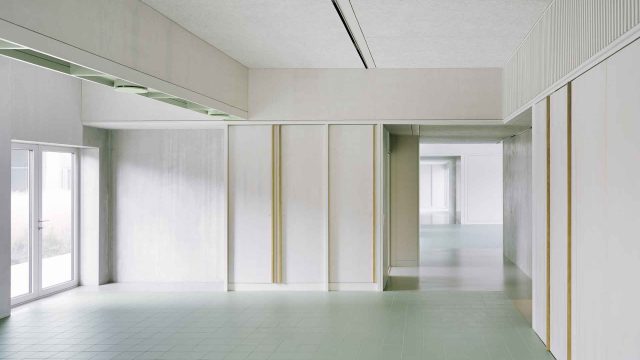
The lunchroom, which occupies a central position, is distinguished by having two different ceiling heights, just like several of the offices. This striking spatial feature shows to best advantage in those areas where staff members gather to eat and is achieved by minimizing the technical ceilings so much that it allowed about half or two thirds of the surface to be raised. Large windows in the lunchroom look out on the company’s internal outdoor areas, with doors opening onto a covered terrace. This is also where you find the building’s only free-standing internal column, placed strategically so that it helps sort the flow between ordinary passing traffic and the queue for the food service area by the kitchen.
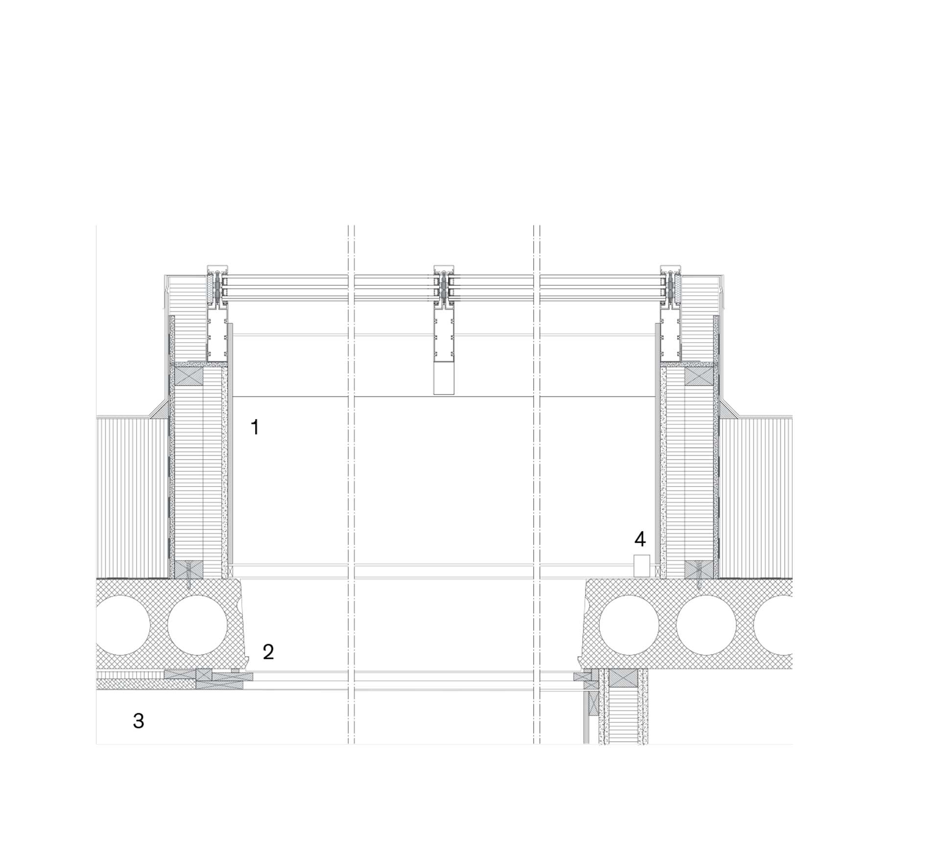
Construction detail, skylight: 1) 12 mm plywood 2) Detailing in pinewood 3) 25 + 18 mm wood wool cement panels 4) Lightning armature. Drawing: Johansen Skovsted Arkitekter
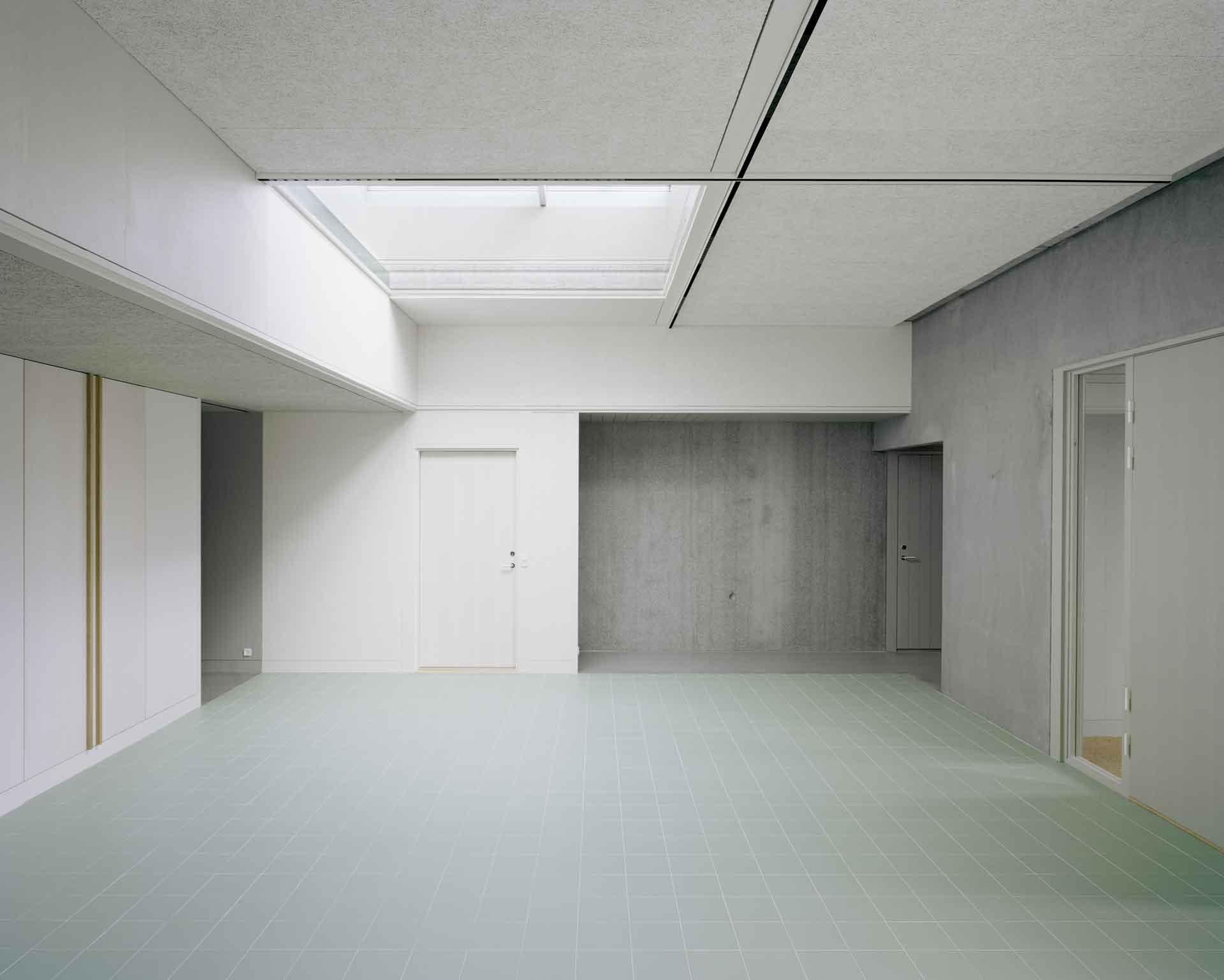
Photo: Rasmus Norlander
Though most of the structural solutions were realized as prescribed, certain details needed to be solved on site as part of the process. These readjustments were customized to fit the existing geometries in the building’s main structural and configurational system, using the same repertoire of fittings as in the rest of the complex.
Secondary assembly details that would have been covered up back in the 60s – joints in the side casings around skylights, windows surrounds and things like that – are here left fully exposed but modulated internally by displacing or pulling back frames and structural front edges. You see this, for example, around the skylights that draw light into the building’s common spaces.
Here, by the skylights, the fronts of the concrete decks meet window profiles and acoustic ceilings with built-in lighting rails, etc. The edges are either left exposed or mounted with enameled steel panels.
All detailing around the building’s apertures is carefully designed and calculated, including where window frames at outward corners meet the perpendicular fronts of the pre-cast concrete cladding, a feature that allows the loadbearing concrete’s surprisingly crisp edges to play the role as sole markers between inside and outside. The inside surfaces of the concrete walls appear with evenly rough surfaces, such as they look after the concrete has been vibrated into shape in the form, and are simply given a light polish, whereas the insides of the window embrasures have been polished down and treated with a pale wash of green paint.
As for all the indoor fittings and panellings, those are designed down to distances of a few millimetres. Tinted plywood, painted pine, white acoustic fabric on walls, white fibreboard on ceilings, matt green tiling on floors and solid oak in conference rooms – these are the main elements of the design. The previously mentioned, free-standing column is pushed right up against the ceiling with its lighting rails and soundproofing panels. When I mention this, it is because one’s gut reaction as a first-time visitor is to wonder why there isn’t a more clearly marked transition between vertical and horizontal – until you realize that all other structural elements meet in the same, close-fitting manner.
The aim has obviously been to strike a subtle, quiet note, a sort of serene purity, which corresponds to the company’s own products. As these products need to be sterile, it makes perfect sense that everything should be characterized by a certain asceticism. This is also true of the architects’ crescent-shaped conference-table units, which appear simple and robust. If anything, the tabletops might have had some sort of profiling or articulated edge – that would have aligned the design even further with other details in the building.
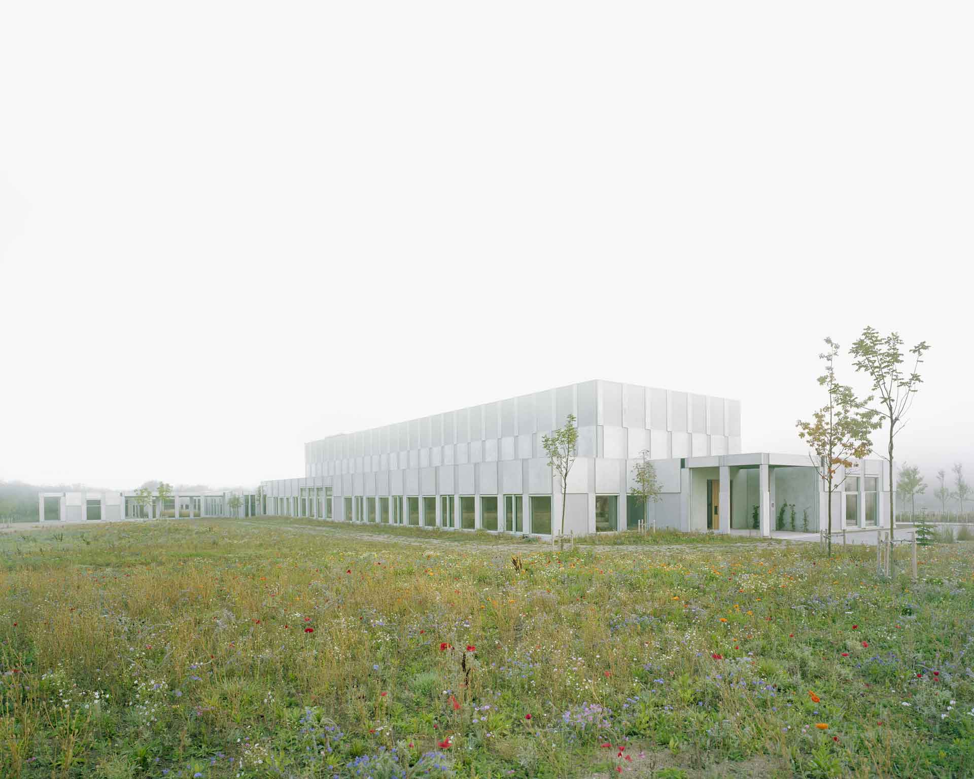
By taking the theme of the ceiling panels and reusing this as an integrated element in the custom-designed ventilation ducts, the design manages to soften and balance the acoustics throughout the building. High-performance soundproof glass was used for glazing in the administrative unit, thus preventing any outside sounds (mostly traffic noise) from entering the offices. The company grounds will in time develop into a planted meadow, with a pond for excess water and a surrounding border of vegetation. With the large warehouse towering above the office building and adding a certain aloof gravitas to the composition, the overall effect is that of a monastery of some sort.
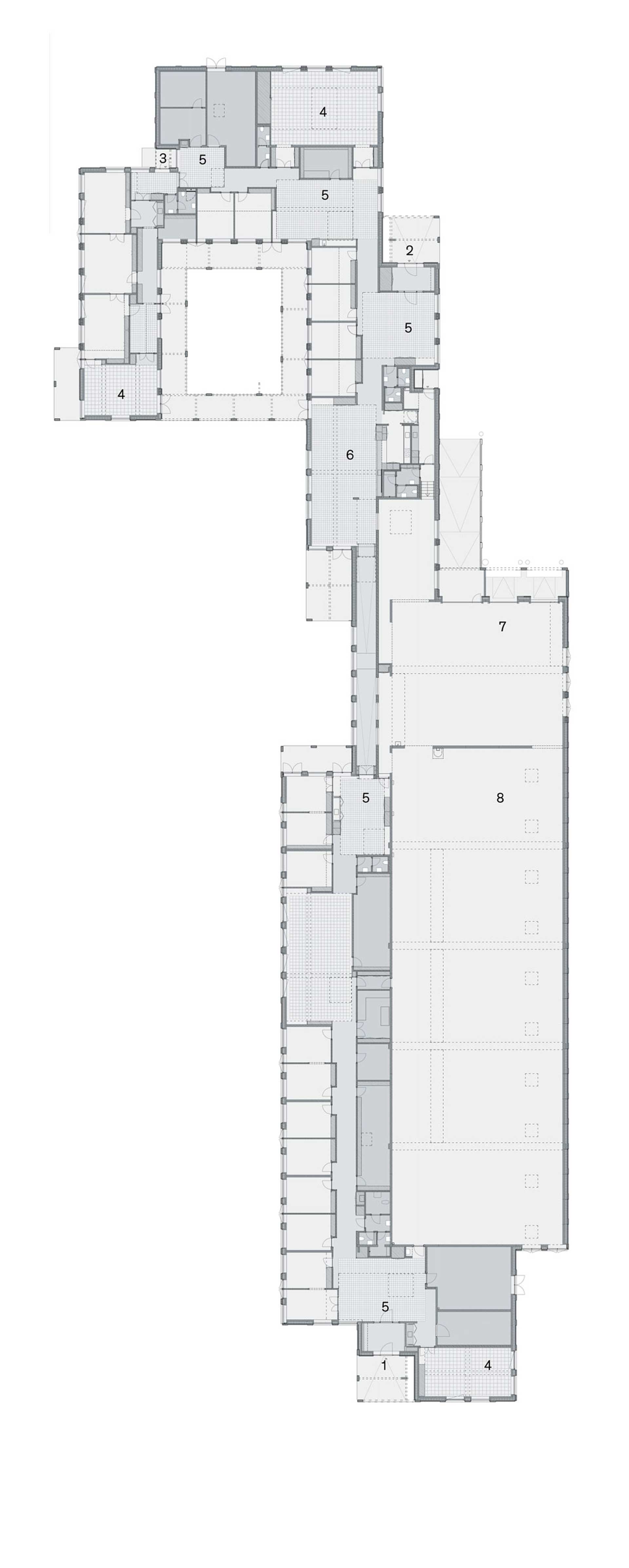
Plan: 1) Main entrance 2) Staff entrance 3) Direction entrance 4) Meeting room 5) Common room 6) Lunchroom 7) Distribution area 8) Warehouse. Drawing: Johansen Skovsted Arkitekter
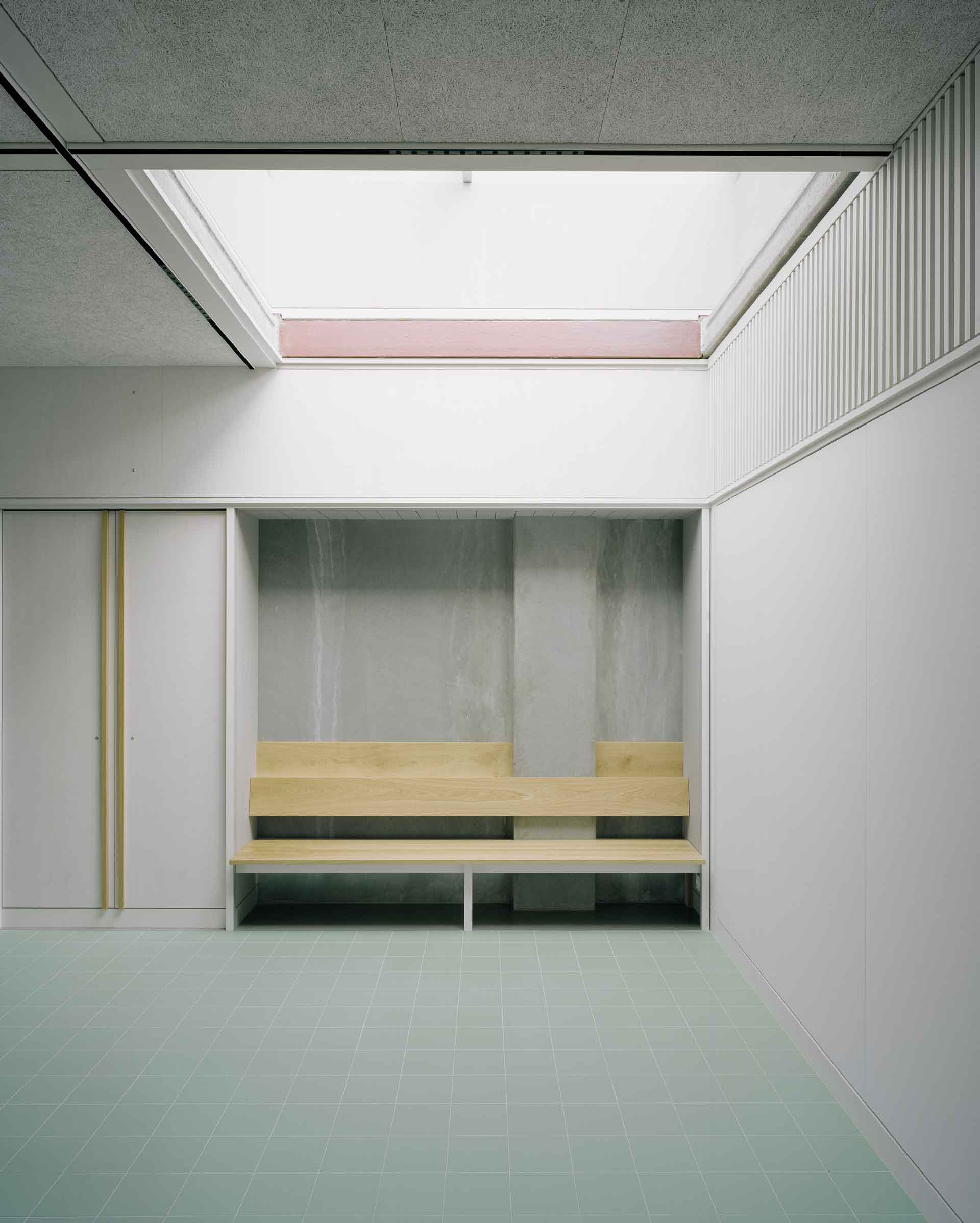
Photo: Rasmus Norlander
The design’s way of alternating between smooth and rough concrete, and between different surface treatments, indoors as well as outdoors, makes the building seem sophisticated and light. And the use of a pale green colour for embrasures and along the sides of external panels, with aluminium frames and surrounds in the same shade, creates a vibrant play across the ground-floor facades. Recessed areas with exposed calcite, a Norwegian mineral used as aggregate in the concrete, alternate modularly and systematically with smooth, grey areas. This modular alternation owes its effect to the fact that the calcite surfaces sit at the top of the building’s segmented pilasters, which vary in depth. The same pilasters metamorphose into columns by the covered terraces and the half-integrated courtyard, thus ensuring that all loadbearing elements remain the same throughout the complex.
This whole play on colours, surfaces and exposures is confined to the administrative floor, but you can’t help wishing that some of those same effects had been applied to the warehouse as well, as its dull, dry expanses mean a lot in the overall picture.
Throughout most of the project, small horizontal and vertical displacements articulate and calibrate transitions between details, elements and spaces, thus confirming an overall impression of artistic integrity. The fact that the spaces themselves are offset internally as a result of directional changes in the building structure, and all passages and spaces are lined with panels and built-in cupboards, makes you feel part of a cohesive whole. And because the structural setup is the same wherever you go in the building, you never feel left out or excluded. Only the warehouse with its ancillary spaces differs markedly from the rest with its plainer, more industrial look. Still, even here a point has been made of correlating the different parts through integrating large windows that look from the distribution hall into a long corridor – a feature which achieves three things at once: it balances out differences in terrain level, connects office spaces and offers a view of the new ‘private’ landscape. The flat, level grounds have been landscaped and, as mentioned before, provided with a water retention pond. New plantings of oak, walnut and hawthorn alternate with open stretches of meadow grass and herbs. In the patio by the management offices is a bed with pampas grass, and along the warehouse at the other side is a new hedgerow of poplar. Even at this early stage, this all appears as a clear qualitative boost, reminiscent as it is of the painstaking care our good old modernist architects took to correlate their buildings and landscapes.
So, as unremarkable as this monasterial facility may seem from a distance, sitting there as an island in the middle of a sea of boring new construction and bulky infrastructure, it all comes alive when you approach the building and venture inside. It’s when you do this that you fully experience the architecture’s subtle charm and profusion of details unfold in a brilliant aesthetic and spatial flow.
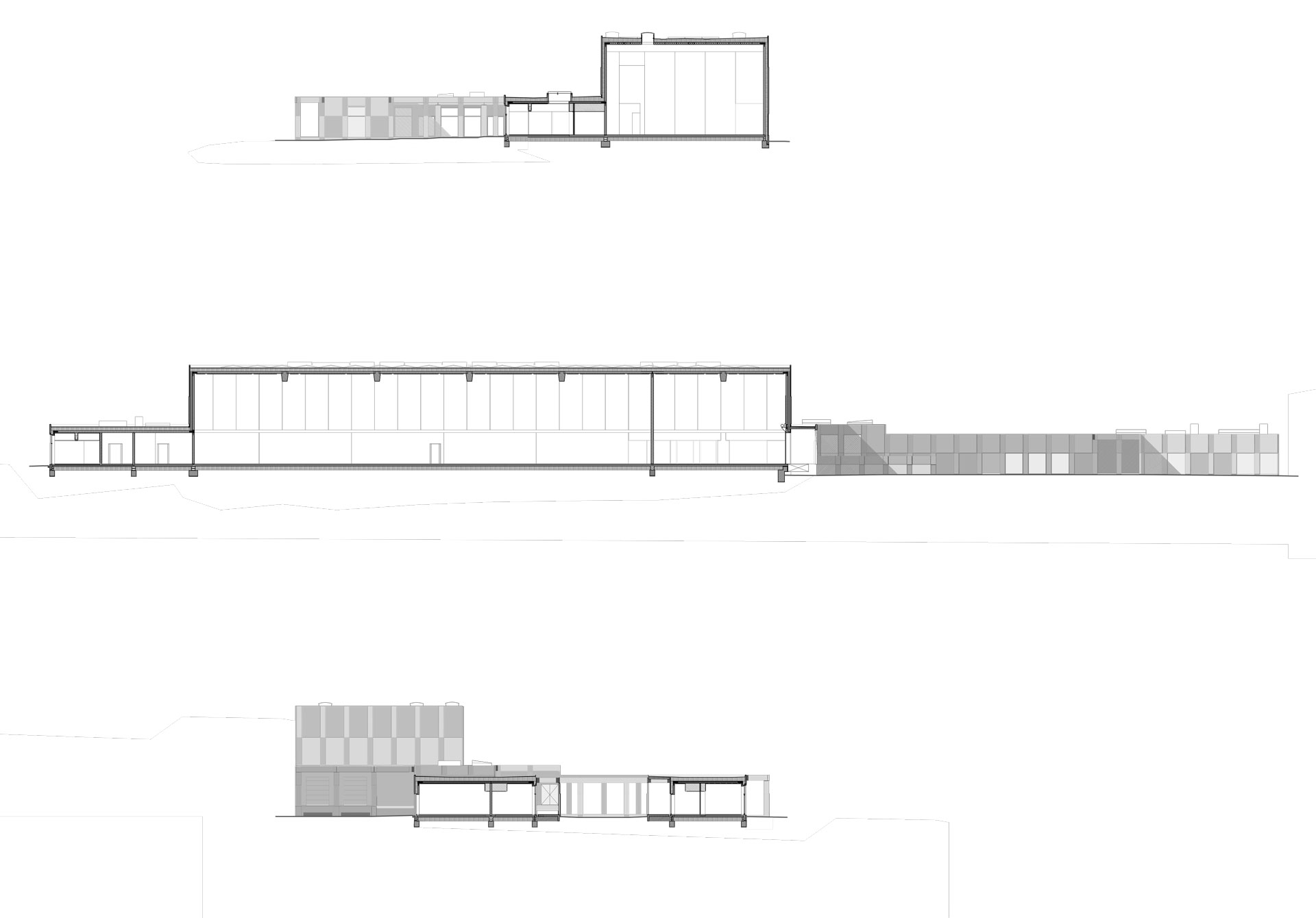
Section. Drawing: Johansen Skovsted Arkitekter
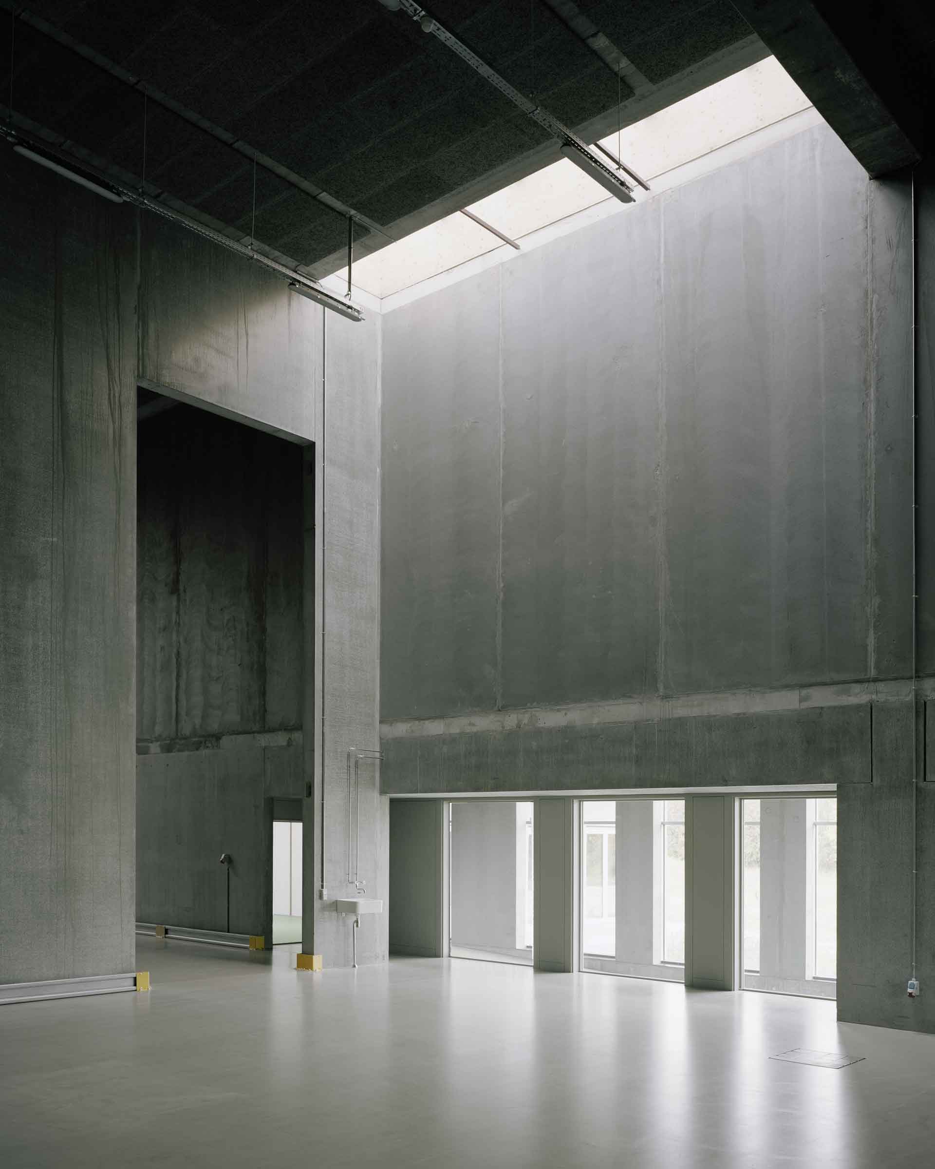
Photo: Rasmus Norlander